If you remember last year, the Pantone color of the year was Marsala (see my post here). While I think Marsala can be used in a sultry or pretty way, this year’s colors are way more my style. I love both rose quartz and serenity, so I was thrilled to see that, for the first time, they blended the two shades!
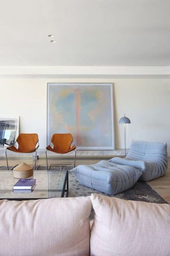
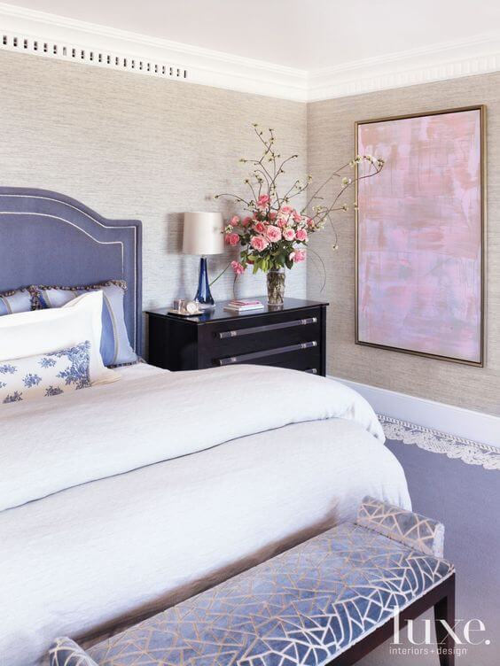
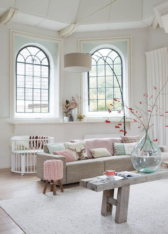
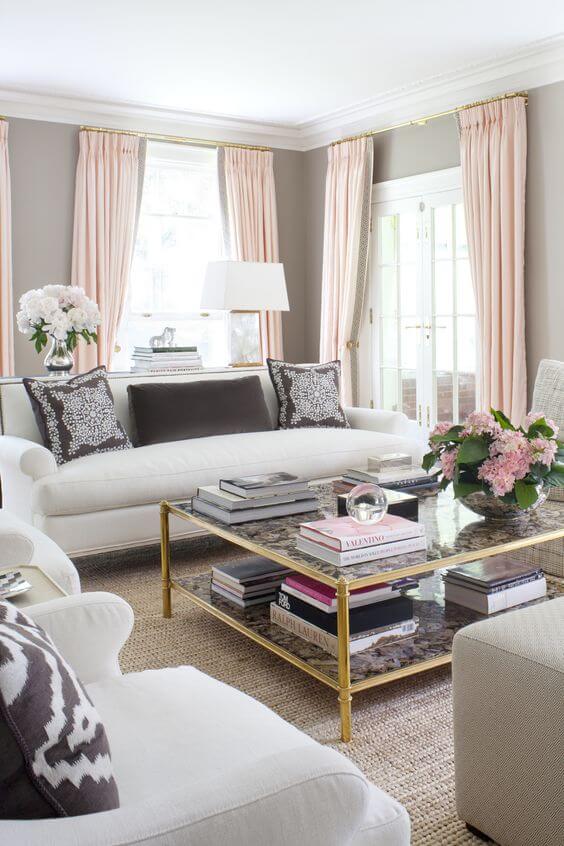
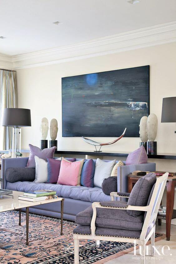
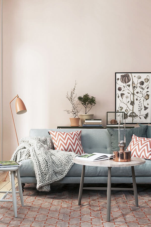
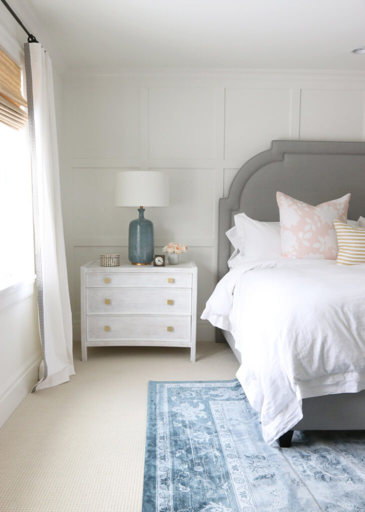
Rose Quartz is a soft, gentle, sweet color while Serenity is a calm, tranquil, smoothing hue. I personally have both tones currently in pillows in my living room (they mix together perfectly on my ivory sofa, along with pops of navy & leopard!)
Let’s explore how these two gorgeous colors can be used together in the home space…
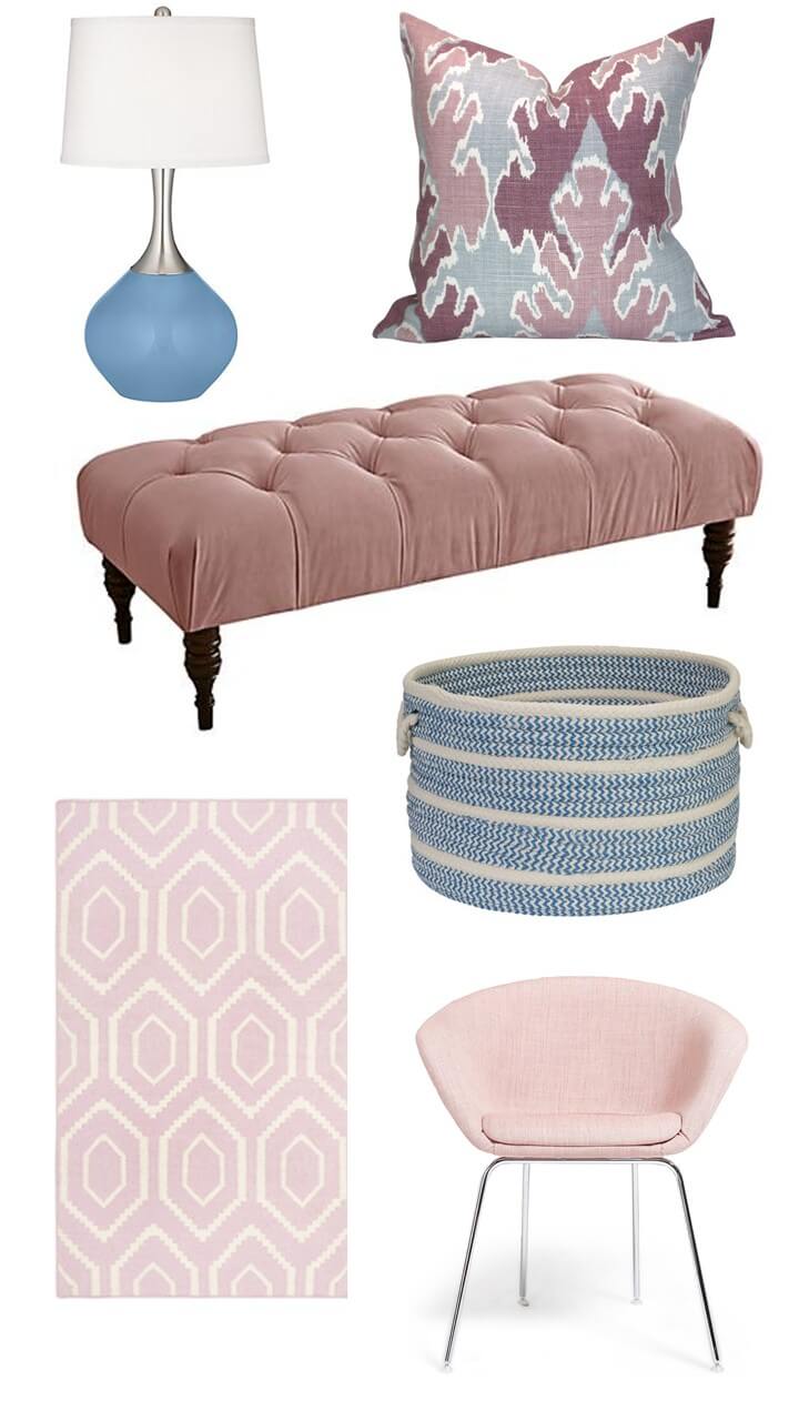
{ lamp | tufted bench | patterned pillow | basket | dhurrie rug | chair}
If you’re looking for some currently items to freshen up your space with, check these out. And don’t forget, fresh flowers such as roses (rose quartz!) and hydrangeas (serenity!) are the perfect way to throw these colors into the mix.
What are your thoughts on the 2016 Panatone color(s) of the year?!
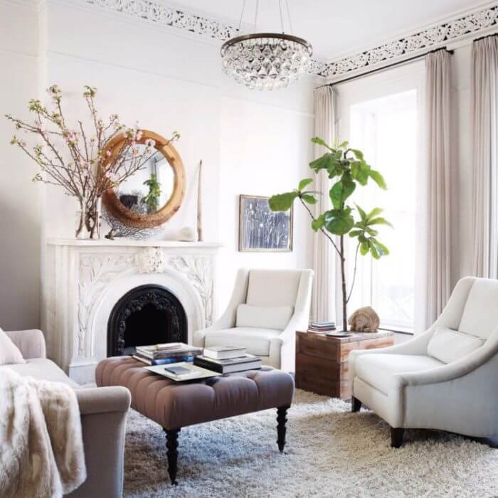
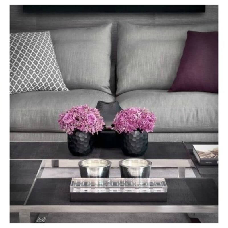

I love this decor inspo! Those two colors are absolutely gorgeous!
http://stopdropandvogue.com