Over the past couple of months I have been working on a project here in Boston that is a three-story brownstone being staged to rent (furnished). While most of the rooms already had main pieces in them, such as sofas, beds, dining tables, the rooms were only about 50% complete. I essentially had a semi-blank space to work with in regards to smaller furniture pieces, linens, artwork and accessories. Lucky for me, my clients understood that we needed to spend a little bit of money to make some money. They had the home painted a beautiful off-white and had new neutral runners put in the entire home (much needed in Boston brownstones).
The brownstone itself is traditional but the owners’ style was very contemporary-modern so my main goal was to warm it up and make it appeal to the masses. Taking a step back and making a cohesive design plan was my first course of action. Once we had all of the items selected and begin the installation process, I noticed that there were quite a few overlapping themes that made each room work! All of the pieces blended so well together yet were perfectly to scale for the exact room they were in. Over the course of this project I learned a lot about spacial planning, interior style blending, accessory editing and overall home staging. So now I would like to share a few tips to staging your home, to rent or sell.
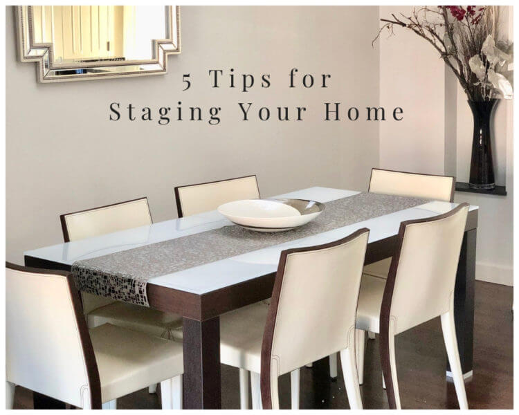
1. De-Personalize The Space. I think this is probably the number one key for any home that is being staged, regardless of the circumstance. The main purpose for staging is to highlight the home and make the potential buyer feel like they could see themselves living in the space. Anytime you keep up the family photographs, personalized artwork, monogrammed pieces, etc. you are making the buyer feel like they’re in your home. Does that make sense? Though the personal memories feel special to you, they likely make anyone who is considering living there feel uncomfortable. Go ahead and pack up your personal pieces for your next home.
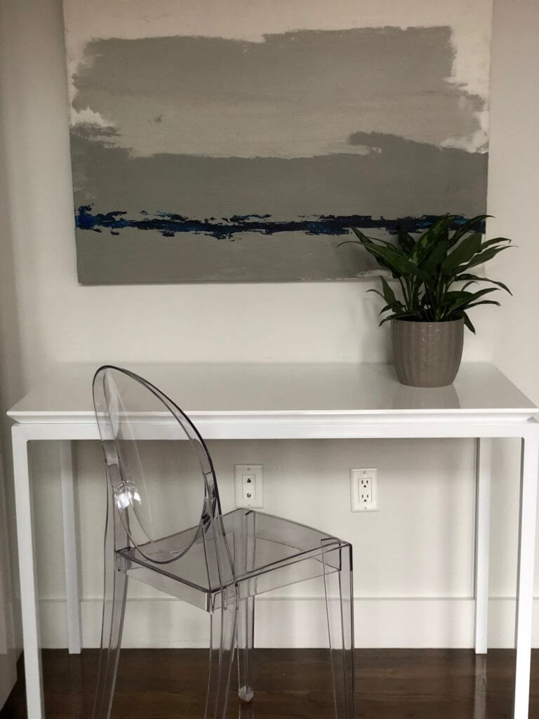
2. Get Neutral. This is probably the toughest piece of staging advice for most people. Remember, just because you like a certain style, pattern or piece doesn’t meant that others will. In fact, odds are they won’t. The best option here is to keep everything is neutral as possible – color, style, patterns, gender, etc. Going neutral may seem boring or blah, but I promise you that it’s not. A neutral space allows a potential new owner to envision themselves there and not be distracted by the furniture or wall color. In fact, I recommend that a fresh coat of paint (grey, beige, white) when preparing to put a home on the market. Nobody wants to walk into a little girl’s pink bedroom and try to envision their teenage son living there. Spend a few hundred bucks to have it painted so that each and every room has more versatility and thus, greater appeal. A solid investment!
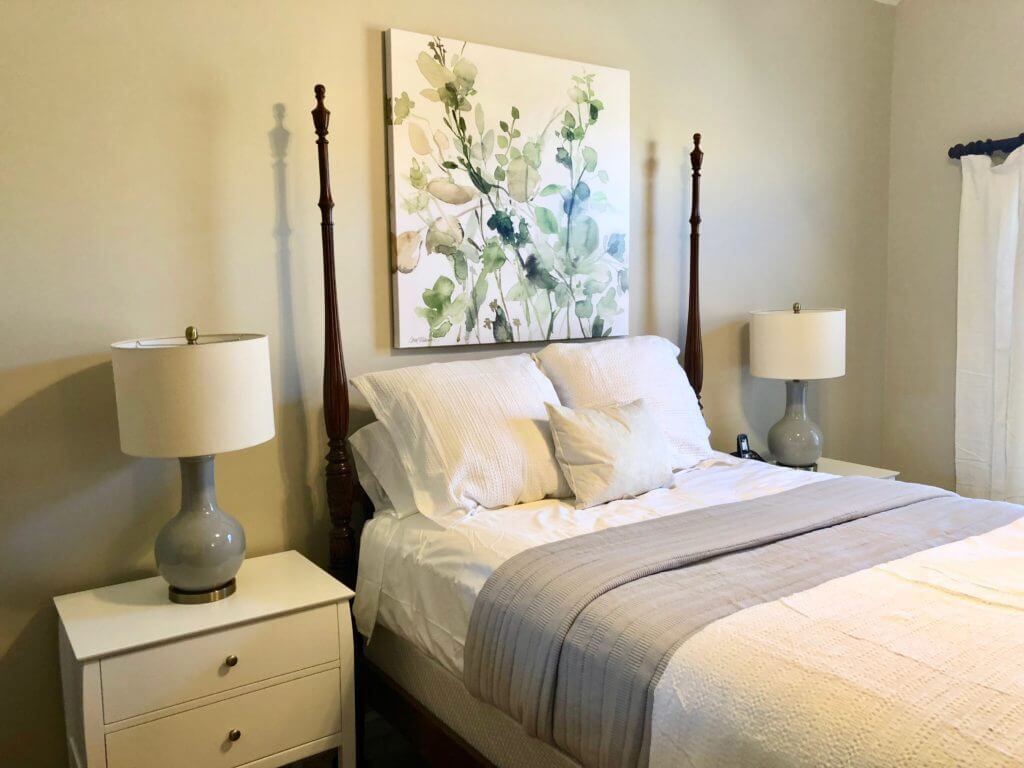
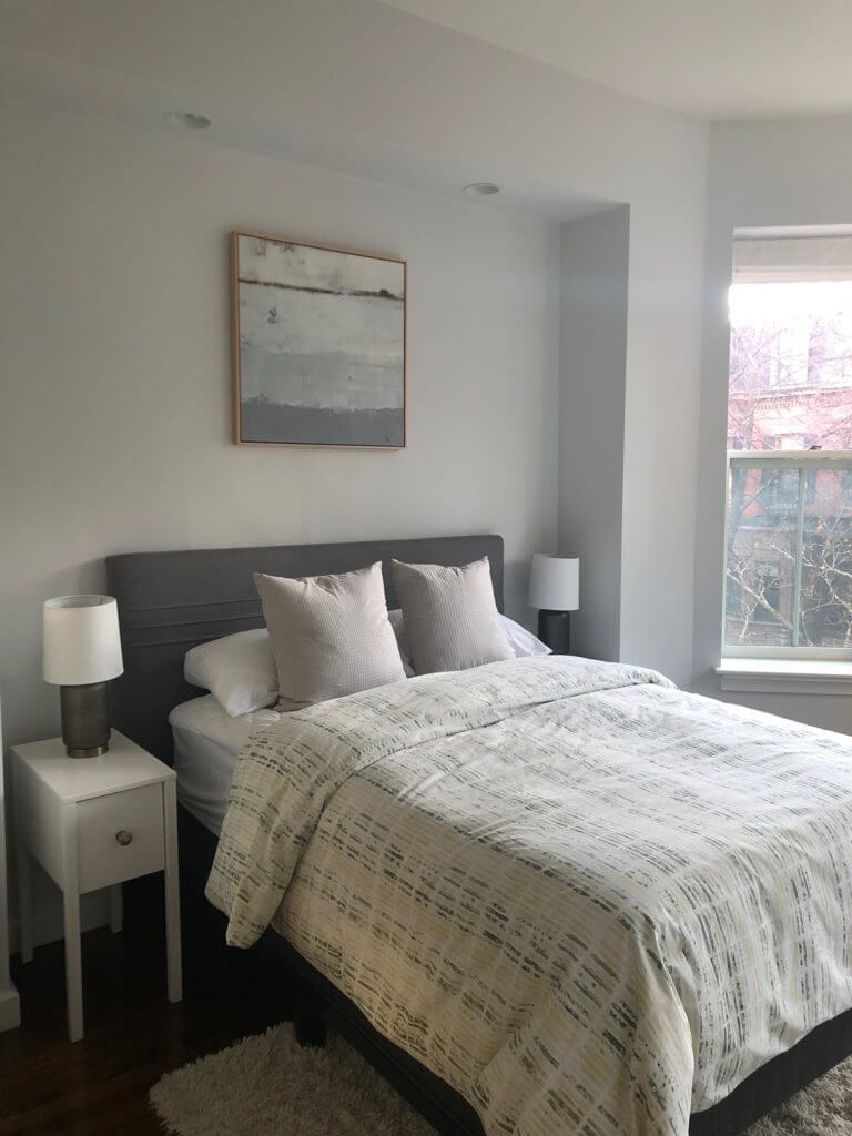
3. Less is more. When in doubt, take it out….I think that’s my new tag line for staging! Oversized furniture, multiple pieces, crowded rooms, full closets – all of these things are the opposite of what you want to do when staging a home. The goal is to edit down your space to a minimal, yet warm feeling. In a bedroom, for example, stick to matching nightstands & lamps, a bed, a dresser, some artwork and a plant or two. There’s no need to have anything more than the basics. Also, remember that most times too many pieces make a room feel overcrowded, cluttered and stressful. Serenity and tranquility is what you want to achieve.
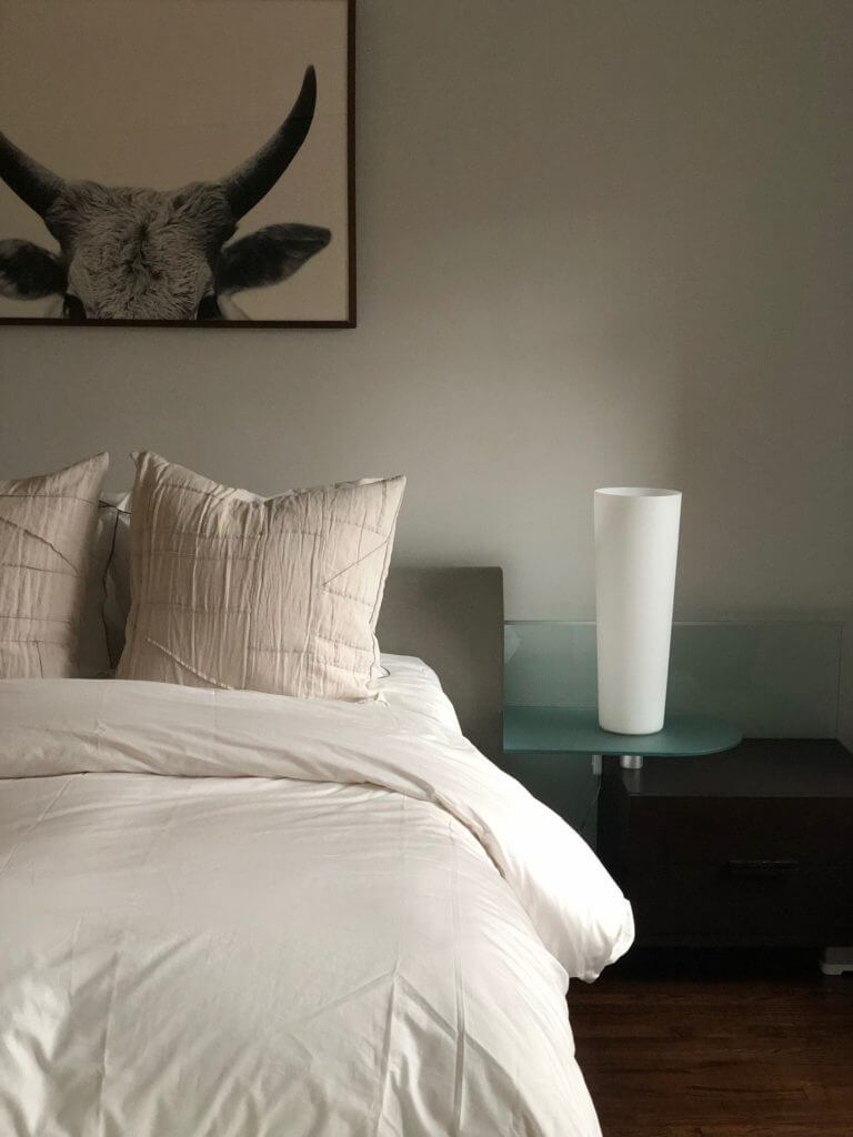
4. Incorporate Natural Elements. Remember when I said to to stick to basics above? Well, bringing in natural pieces like plants, greenery, woven baskets and wood pieces are how a space goes from cold to warm. I like to think of the natural elements as the jewelry of a room. Start with a blank space, add in neutral furniture and then bring in color, warmth and positive energy with natural elements. Most of these pieces are also multi-functional, such as using a woven basket as blanket storage or fresh eucalyptus as a vase filler.
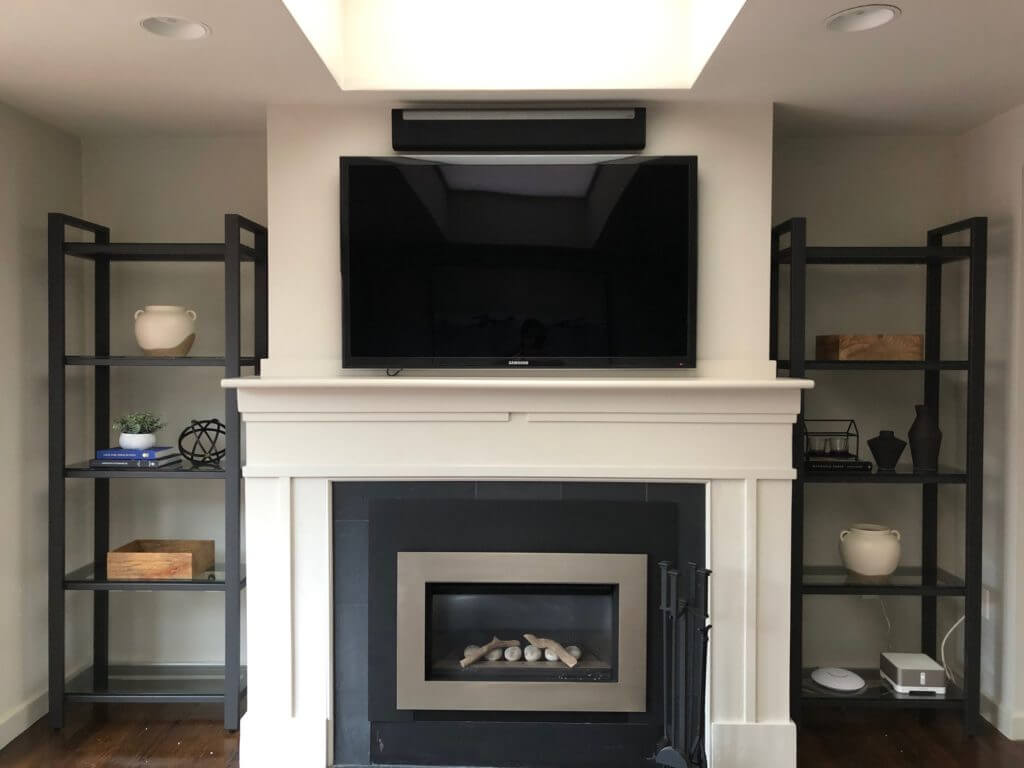
5. Highlight the Best Features. Now, this should be a no brainer but I think that often times people get caught up with decorating a home and end up highlighting the best part of it! For example, don’t put a large piece of furniture in front of a set of beautiful windows. Highlight the tall ceilings by decorating vertically with a tall bookshelf or gallery wall. Don’t cover up beautiful wooden floors with wall-to-wall rugs. You get what I’m saying here, right? Think of this from a buyer’s perspective – if the home was empty, what would stand out most? Stage every room with those key qualities in mind.
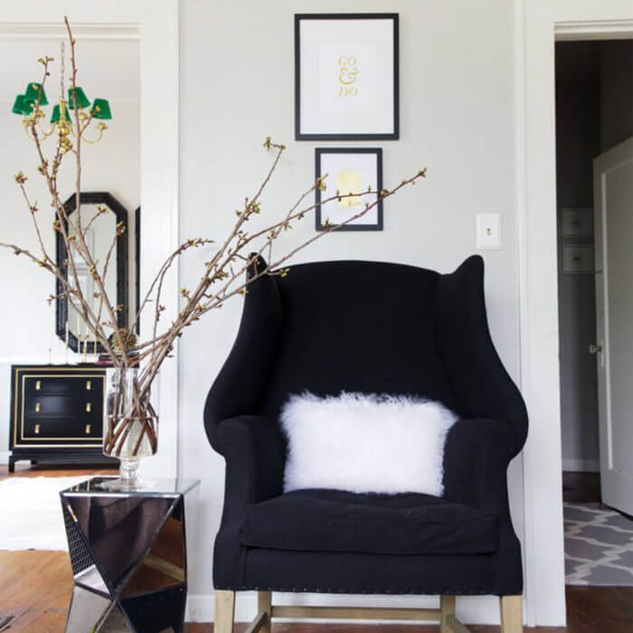
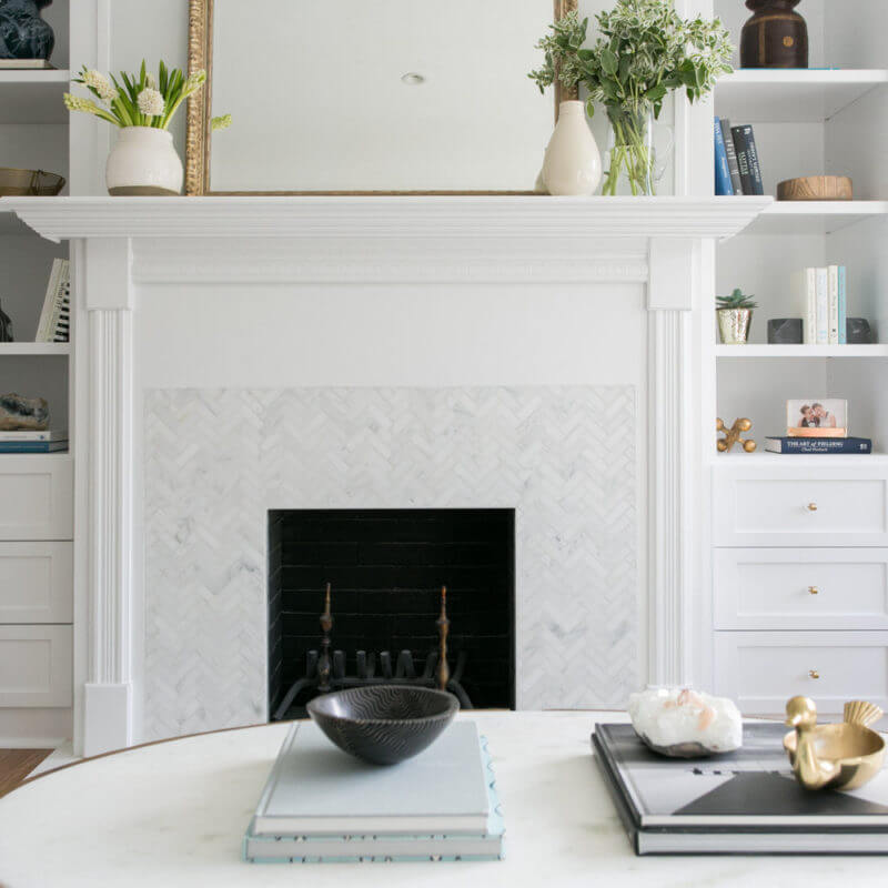

[…] it comes to staging a home, there are quite a few layout tips and styling tricks that are often to use to help the home […]