You may remember the powder room design plan that I shared back in September. (See the post here). To refresh your memory, this is a window-less powder room that has been intense red for years & was in desperate need of a makeover. The client wasn’t in the market for a new vanity, countertop or faucet so we were stuck with what we’ve got & did our best to make it work. Rather than go with a typical neutral, they wanted to bring a pop of wall color into this space. Here’s the plan I came up with:
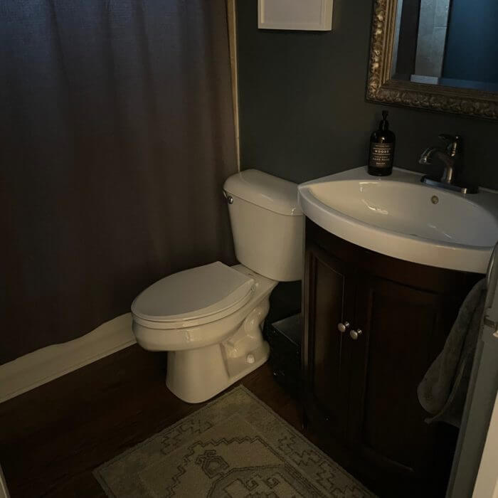
While I still wish the vanity/countertop were more of a gray-ish tone, they’re pretty much tan in person; however, that was what we were working with. The space looks much more modern!
First off, the paint color really took the powder from from 90s loud and outdated to 2017 rich and warm. Many people are scared to use a dark wall color in a small room in fear of it feeling to enclosed, but don’t be! It’s actually quite opposite – in this case there is no overhead lighting or windows, but the room does not feel smaller. In fact, it feels a bit calmer and more neutral. Hale Navy for the win!
Second, what really updated the space to me was the new mirror and lighting. The wall space is pretty limited here so the original mirror was a bit too oval & ornate. It looks pretty dated along with those lights. Plus the scale just isn’t right. We got an infinity mirror and a more modern light fixture with clean lines – it really makes the wall feel larger and less crowded.
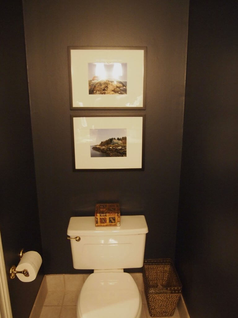
Lastly, we updated all of the accessories. It’s hard to tell in the picture, but when the light is on, the white accessories really brighten up the space. I am a big fan of just some soap, a candle and a simple plant. The Lucite tray keeps things organized without taking up any visual space. Also, note what a difference using the proper sized-to-scale artwork makes, especially in the second set of photos. The two original black frames were too small and didn’t sit well on the wall. The new frames are a more appropriate fit for the wall and look much more intentional.
(Please excuse the bad photos, I really struggled to take some good shots with zero overhead light).
Again, I’m really embarrassed with the horrible photos but I wanted to give you an idea of what a can of paint and some new accessories can do! So if you don’t have a full renovation in the budget, have faith that you can easily transform a space for under $500!
Leave a Reply