If you’ve been reading my blog for a while now, you probably know that I am a huge fan of monochromatic, classic, simple design schemes. I love neutral colors, clean lines & timeless fabrics. (Check out this and this for inspiration). That doesn’t mean I don’t appreciate a fun space! An ideal place to start experimenting with bold new colors/art/wallpaper is a powder room! Why? Well, it’s usually a hidden space (if it turns out ugly, you can hide it!), it’s a small space (less expensive) and it’s easy to change! Let’s explore…
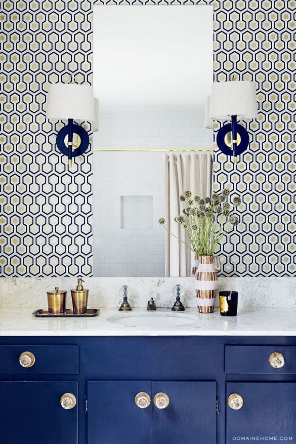
This geometric wallpaper & painted cabinets make for a very busy space, but the simple mirror & white subway tile balance it out…
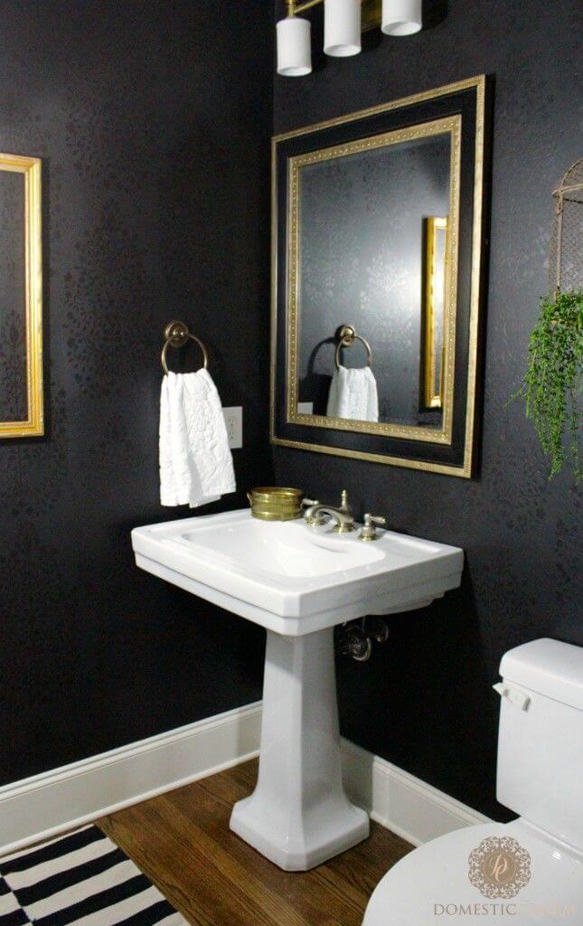
Y’all know I love a black wall! Combined with classic gold & white accents and a touch of greenery, this look feels warm & modern. My favorite look!…
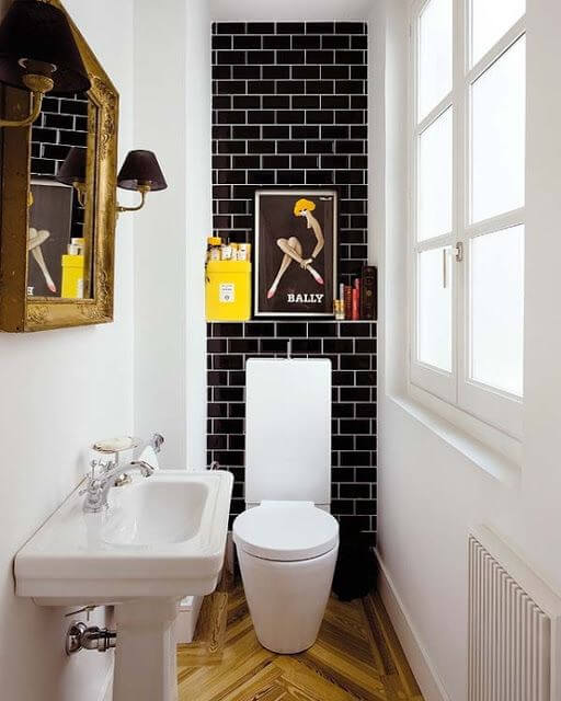
If you’ve got a narrow space, this is an excellent example of how to design with color. The all white walls & window provide light & keep the room feeling as open as possible, but the black tiled back wall is such a fun, unexpected surprise!…
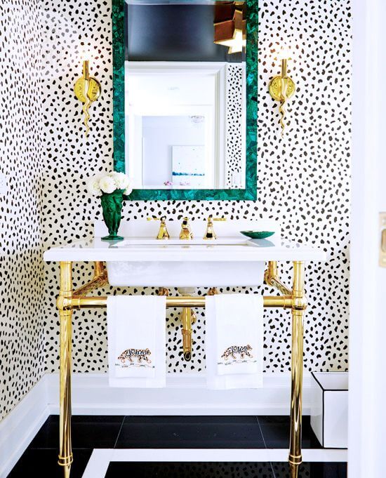
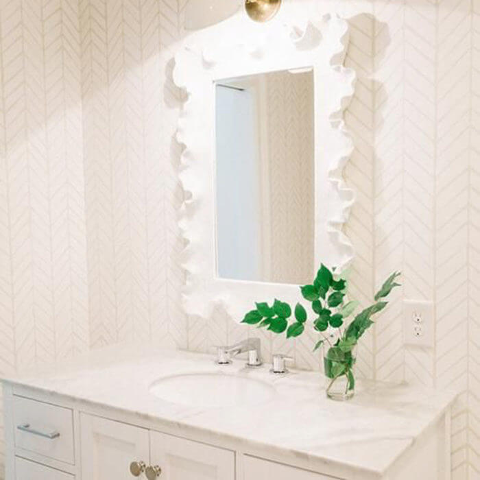
Another example of wallpaper. This one is a bit more neutral and doesn’t feel too busy. I would have loved to see some black sconce shades here, as these seem to get lost in the wallpaper. Side note: how fabulous are those hand towels?!…
I can totally see this powder room as a more realistic option for many of us.I adore the molding and the wide patterned wallpaper (feels less busy/chaotic). Molding is WAY too underused and underrated. It’s such an easy, inexpensive way to add a custom feel to a room. Read more about the space here…
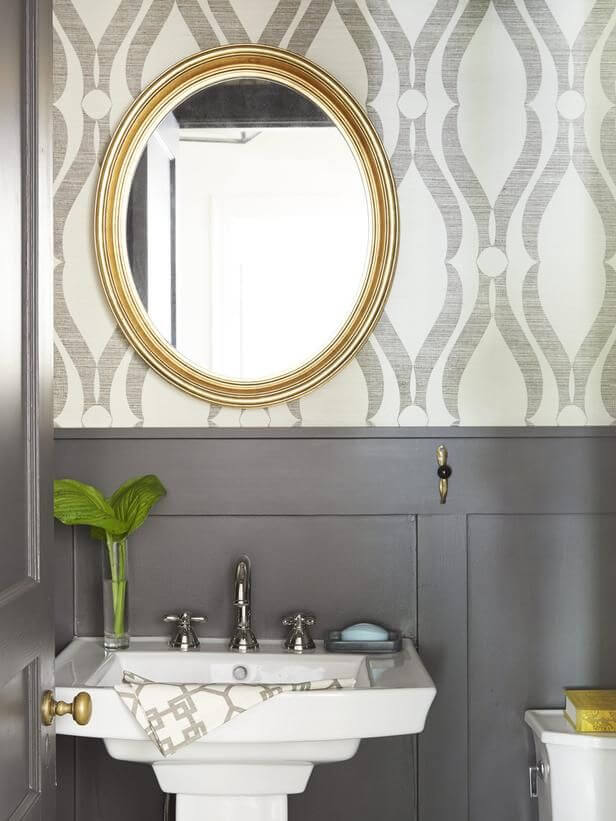
Last but not least, the powder room that Emily re-did last year. She has a very classic taste but went bold with this wallpaper. It totally works, given the simple, industrial feel of the sink & mirror (<–the best mirror for any room)…
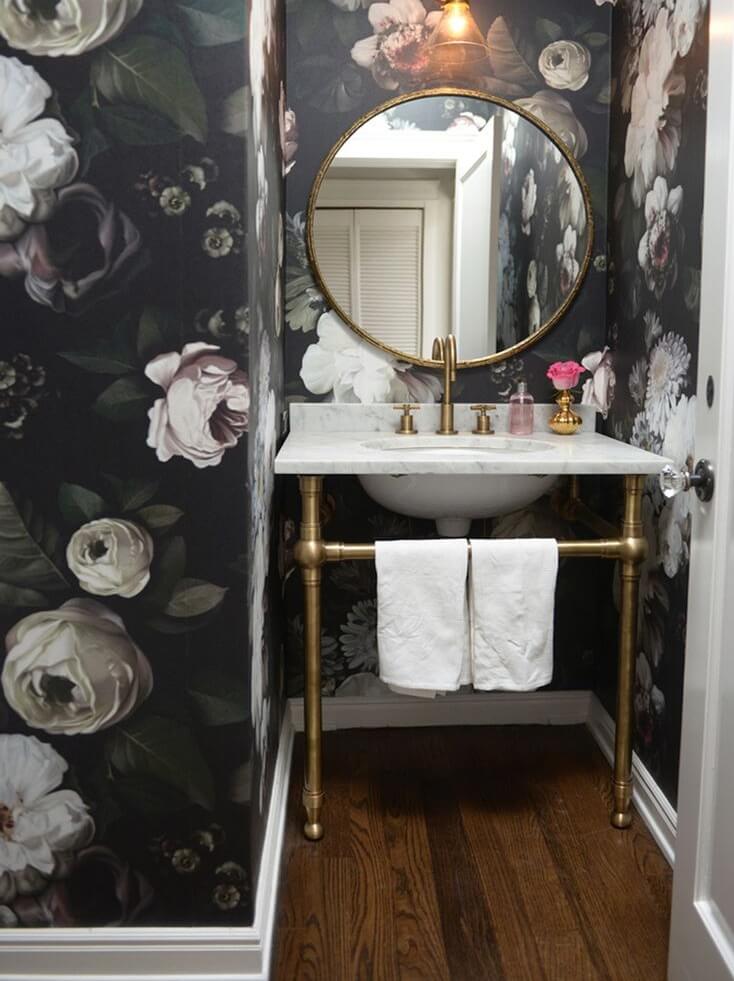
Would you experiment with a bold powder room?!
Which one is your favorite?!
I love all of these looks! The fifth one is my favorite. 🙂
Jenn | http://www.thisjenngirl.com
I second you about molding being way too under used! I also love the dark floral paper in the last pic. Such inspiration! Hugs, Kait
http://makeminemaroon.com