One of my clients down in Georgia has been updating quite a few rooms in her home. Together we have been working on updating the kitchen, dining room, living room, main foyer and hallways for about 6 months. The first room that I re-designed for she and her husband was their guest bedroom. I often begin multi-room projects with bedrooms because they are typically a quicker turn around and a natural place to start. I also find that clients feel safest starting with a bedroom since it’s a room not used quite as often – they can see the project through, start to finish, and it helps gain a little bit of trust with the design process (which can be long and frustrating).
BEFORE
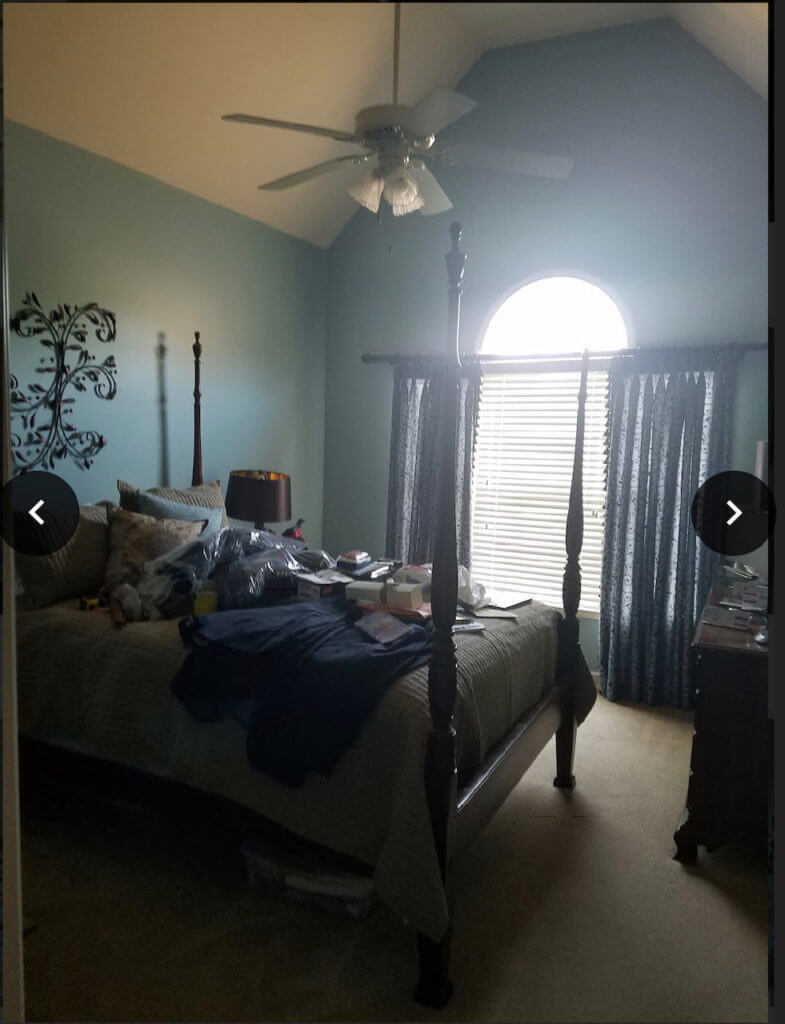
To give you an idea of what we started with, here, above the guest bedroom “before” picture, prior to my taking on the project. As you can see, there’s a lot going on here…any boy did I see potential! The main things that I wanted to change here were (1) wall color (2) remove clutter (3) modernize the space (4) lighten it up.
We started by painting the entire space SW Agreeable Beige; the dark blue was just not working in any way and the home owner didn’t like the color. I initially wanted more of a gray-toned color, but there is so much light in here and the attached guest bathroom has beige-ish color tile so this worked best.
Then came furniture placement: I moved the dresser (it was an obstruction to walk to the far side of the bed), removed the dark nightstands, lamps, wall art and drapes. Everything was so dark and heavy that the space felt cramped and blah. By removing excess clutter, this not only created extra space (literally) but it helped to balance out the room by creating more visual space. This is what I mean by less is more.
Understandably, they weren’t in the market to purchase all new furniture so we kept the four poster bed and the dresser. The nightstands they had were too small scale and too dark. The whole room felt a bit too “matchy matchy”. By bringing in lighter furniture pieces, I was able to balance out the space and modernize the room. Mixing traditional pieces with more modern style pieces totally transformed the space. In fact, my favorite rooms are always ones that mix design styles.
Lastly, we lightened the space up big time with paint, white and gray bedding, white drapes and hints of green. To me, this was the biggest change of all. I still cannot believe how much bigger and more spacious this room feels. It is now so warm and inviting and the home owners were blown away.
AFTER
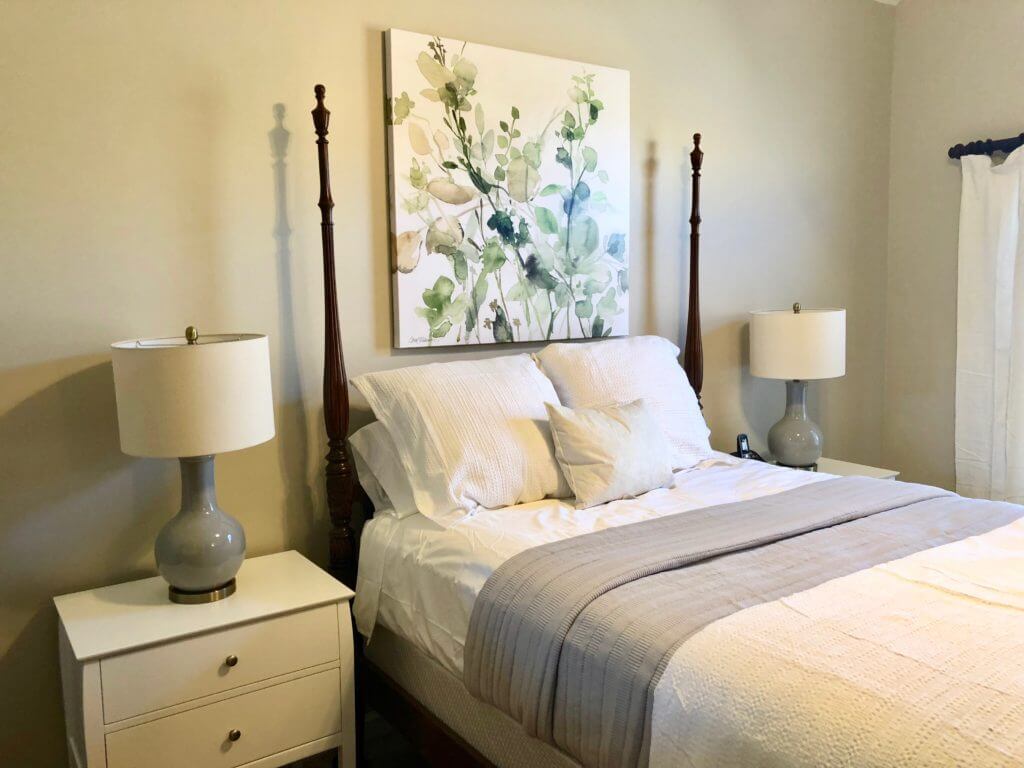
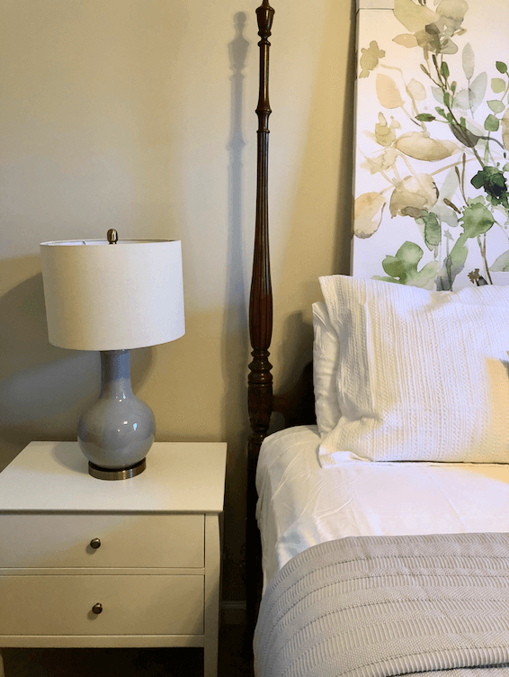
(lamps / nightstands / artwork / gray coverlet / white duvet cover)
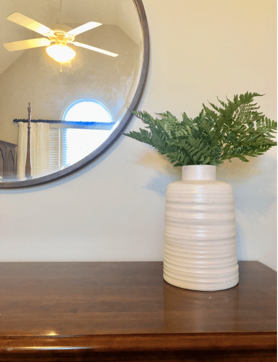
(mirror / vase / drapes / greenery, from Whole Foods)
Unfortunately our oversized lumbar pillow did not come in time for the photo shoot; however, here is a really poor quality (sorry!) iPhone picture of it once it finally came. It’s a shame I couldn’t get a better one because it’s really beautiful in person.
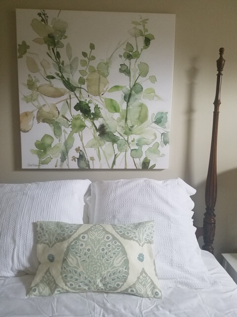
The pictures aren’t as good as I hoped (taken on my iPhone, in a rush) but hopefully you can see the transformation of the space!

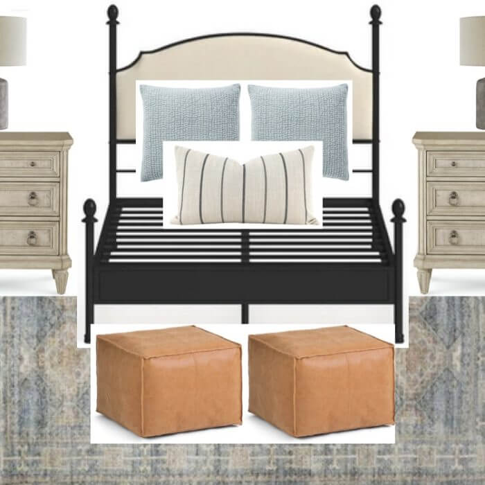

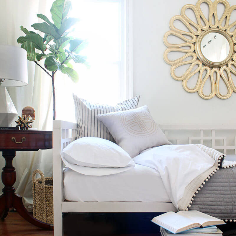
[…] I was brought onto this #wellesleyreno project, the guest bedroom was the first room on my list. I have mentioned before how guest bedrooms are an ideal place to start any multi-room project and typically a space in […]