When I was brought onto this #wellesleyreno project, the guest bedroom was the first room on my list. I have mentioned before how guest bedrooms are an ideal place to start any multi-room project and typically a space in which home owners allow the designer more freedom. In total, we worked on 4 different spaces and I just recently got around to taking pictures of this room, so I’m excited to share!
So let’s talk about what this couple wanted in the space and how I accomplished it…
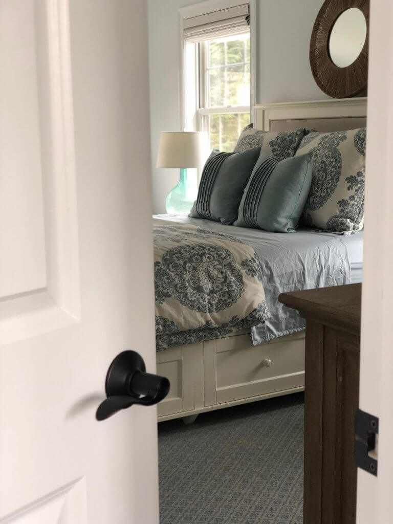
First and foremost, they wanted to keep the current bed and beautiful rug that were already in the room. The bed was super heavy and pretty new so we didn’t see any sense in changing this. Luckily the bed is a cream color (neutral for the win) but it is quite large so it definitely made spacial planning a bit challenging. I balanced out the room with the dresser and the daybed on opposing walls (the room is pretty darn big – the pictures don’t depict how wide it is) and opted for minimal decor otherwise. Originally, I was going to change the bedding to all white but I think that this blue pattern duvet cover really softens the room.
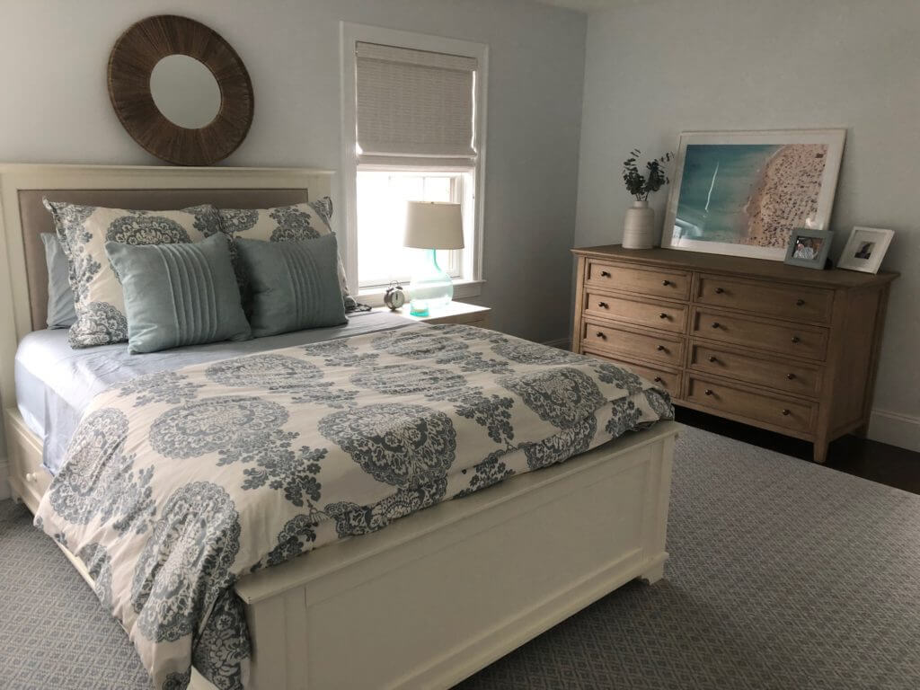
( mirror – sold out, similar / nightstand / clock / lamp, similar / vase / dresser / artwork)
Second, this room really needed to have a relaxing and serene feel. This is the main guest bedroom in the house and it’s perfect for house guests as it’s tucked away in a quiet corner of the home with an en-suite bathroom. It is an ideal escape for any house guest when they want to get a moment of quiet or sleep in. The double closets and dresser allow them to unpack and feel right at home. The bedding is also super soft comfortable, which of course is an added touch.

( rug / daybed / nightstand / lamp, similar / mirror – sold out, similar <- needs to be hung, whoops!)
Lastly, the couple wanted this room to be functional in two ways – one, add additional storage for house guests (hence the new, oversized dresser) and two, to create a space for reading. The window in the far corner has natural light pouring in and is on the quietest side of the home – perfect for a reading nook! Initially, I wanted to put two chairs but my clients mentioned that they would prefer non-chair seating as the home already has a lot of chairs. In the end, I am so glad we went with this daybed as I have heard wonderful reviews back – apparently their sweet little girl just loves reading there every night!
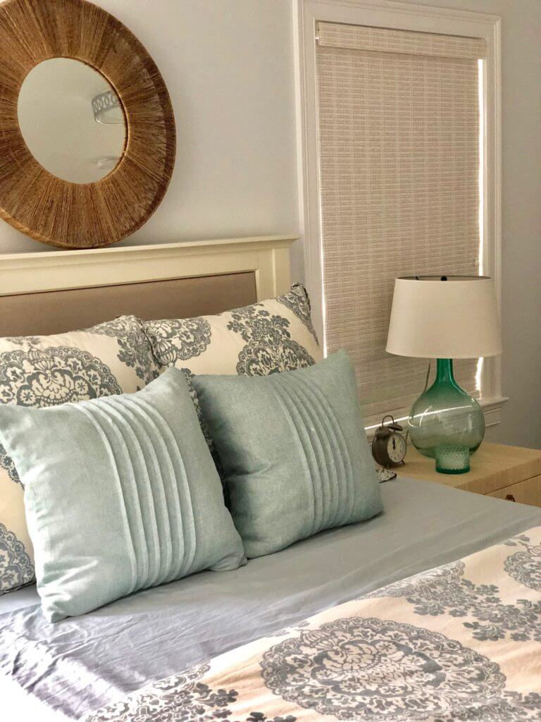
(mirror – sold out, similar / nightstand / lamp, similar / clock)
The room is spoiled with beautiful natural light and so we added various textures and layers to soften up the room. The large rug really anchors the space and gives a lot of color so I opted to go with more neutral furniture pieces. It’s hard to tell in the pictures, but the Serena & Lily raffia-wrapped nightstands provide great textural detail and helps to mix in beachy and modern. Also, we kept with the blues and greens for color and coastal vibes as the couple loves the beach! They own two homes in Nantucket and so bringing in a coastal feel was important to them and is reflected in other areas of their home as well.
Overall, I am really pleased with how this room turned out. It’s always challenging coming into a project where there are already pieces in play so I think we did a great job working with what we had. The room is bright, yet calm and large yet warm. It really is a spectacular guest bedroom!
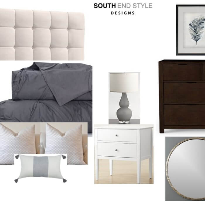
[…] or too feminine. Additionally, it’s best to avoid any crazy patterns or wild themes. Decorating a neutral bedroom can be beautiful with whites, grays, blues, greens and other colors – when tastefully done, […]