This is a topic that I posted about well over three years ago, but I thought I would revisit it and add some updates thoughts and examples. I get a lot of questions about styling – surfaces, in particular. Friends, family members and clients are often asking what should be on their coffee tables, how much should be displayed on their nightstands and how to style bookshelves to be functional but aesthetically pleasing. I linked a few oldie but goodie posts there; over the next few months, I will be updating most of my “styling” posts as there are so many more examples from my design portfolio that I want to share!
For today, I thought that we could start with a vignette. What is a vignette, you ask? Well, technically it is a grouping of items that tells a story and flows together. In the interior design world, we like to pretty much use that word interchangeably with a grouping of objects on a surface – think a console table, a mantle, etc. It is a surface location that is being styled to look cohesive, interesting and beautiful.
Styling a vignette is easier than you think! In fact, try not to overthink it. Often times people will (a) add too many pieces and the space looks cluttered or (b) place a few pieces that have no variety so it looks oddly thrown together. The best thing to do is play around with items – I like to switch various books, candles, vases & decor from room to room until I find the perfect home for these. Now there are a million ways to style a vignette but here are a few tips to help guide you along the way…
Add Some Height
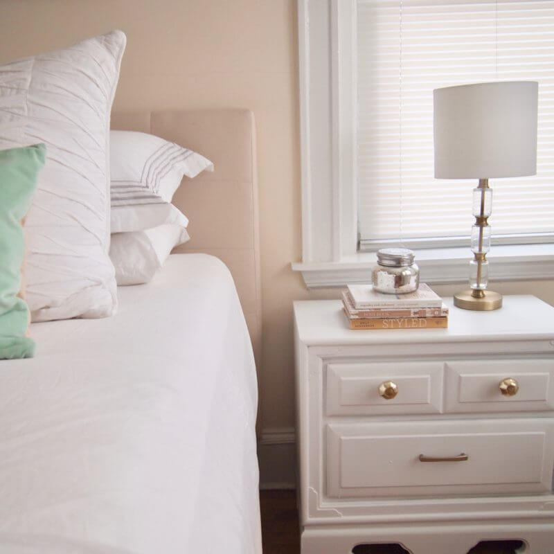
Height is key! I like to start with my favorite piece and then add taller / shorter / wider / skinnier items from there. Not only can you can cover more visual space by adding height but you also create such interest to the eye. There are, of course, a few tricks for adding height when you don’t have a particularly tall item. You can throw in some tall greenery into a vase or add a tall plant. Also, you can stack anything on a few books to create some variance. Again, just play around with it and you will quickly notice how much better your vignette looks when all of the items are not at the same exact height.
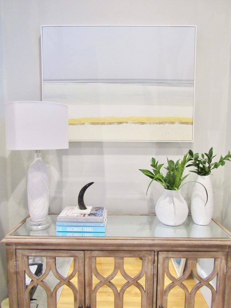
Stick to a Color Pallette
Now, this certainly isn’t a rule of thumb (in fact, I like mixing and matching colors and metals); however, this is a good guideline to help you get started if you are lost. Keep it to three colors – say white, gray and blue. In our home, I have a similar color scheme in the entire house actually. I didn’t really mean to do this but I am just drawn more towards neutrals, blues, grays and blacks. I don’t think I have a peep of red, orange or green in my home (other than with plants). This keeps the look cohesive and makes it easier to mix and match down the road. Remember, you can always add a pop of color with fresh flowers.
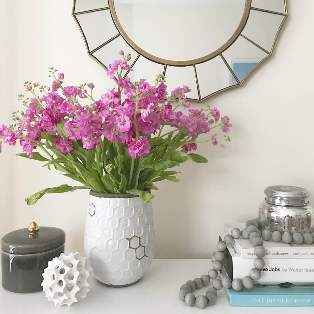
Add a Touch of Nature
Nature can be incorporated in so many ways, including fresh flowers, live or faux greenery (the below is actually dried eucalyptus which I love) and wood accents to name a few. I will always prefer real items; however, if there isn’t natural light, add a high quality faux plant. Natural touches like this add some softness to the area while freshening the air (check out my post last week regarding plants in your home).
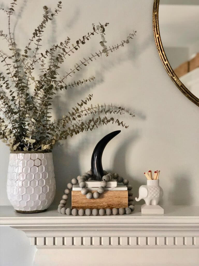
Think Sets of 3
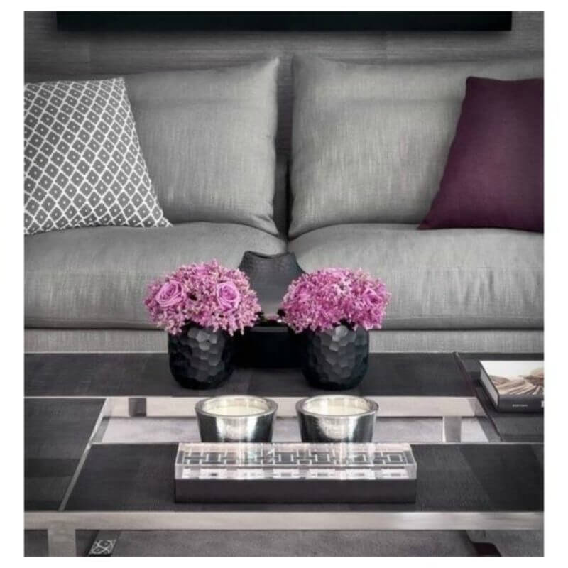
A key component to any design is decorating in set of 3 – this could be candles, pictures, books, decorative items, etc. Our eye is drawn to this combination and it’s more aesthetically pleasing. You’ll start to notice that a lot of decorative accessories are sold in sets of 3! As you can see, I styled this vignette by keeping with a white, gold & blue color pallet, bringing various height and texture with the items. Keep these rules of thumb in mind & you will feel comfortable styling any surface in your home.
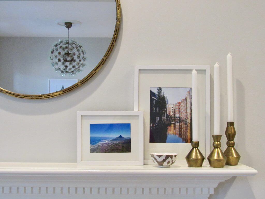
Build a Story
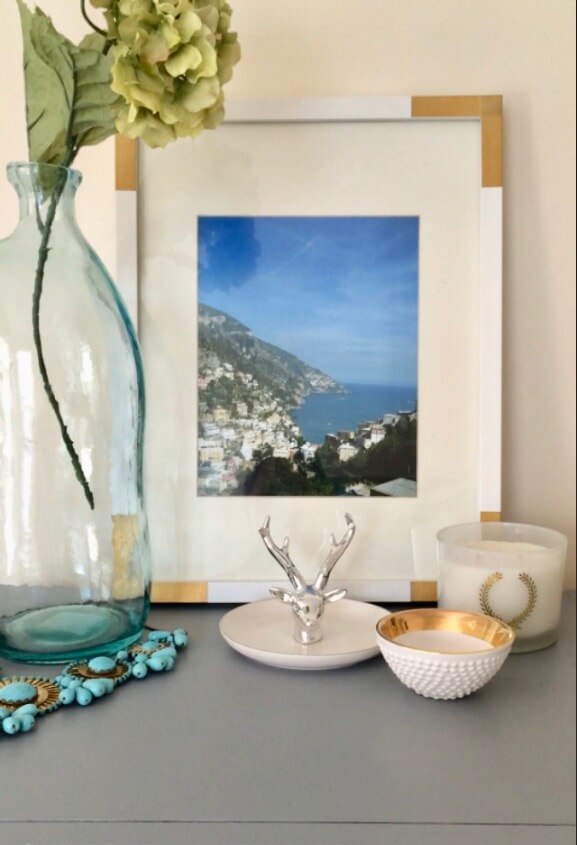
This may sound kind of weird, but hear me out. I like to start with my favorite piece and build from there. For example, in the picture below (apologies for the less than stellar quality – it’s an old one), I wanted to display this photograph that I took of the gorgeous Amalfi coast. My frame is 11×14 so I started with this larger piece to mount the space. From there I added this blue vase to add height and a flower. Then I added a set of three display objects that were smaller and shorter but that all kept with the white and gold color scheme. I added in this pretty necklace to bring in a pop of blue and create a fun look. Do you see how this approach takes all of the different elements and builds into one?! Pretty cool, huh?
To help get you started, I found a few versatile items I recommend:
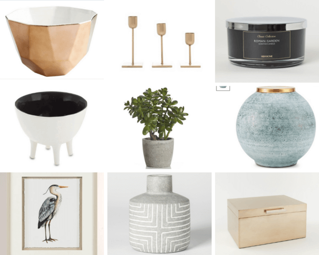
{ copper + white bowl | set of 3 candles | scented black candle | bowl with feet | Aerin round blue vase
| jade plant | artwork | gray and white vase | decorative box }
You could definitely see your expertise in the article you
write. The arena hopes for more passionate writers like you who
aren’t afraid to say how they believe. Always follow your heart.