If you remember a few months back, I shared some of my nursery design options that I was considering for Baby Koz’s room. Since we left the gender a surprise (which, side note, I am SO glad we did!), I wanted to keep the room neutral with mostly soft tones and the bold, yet calming dark green accent wall. My original intention was to wallpaper the top half of the wall but when Duke arrived 6 weeks early, that plan was nixed! I’m thinking that I may get it done this Spring or wait to do it when we are pregnant next time to switch things up.
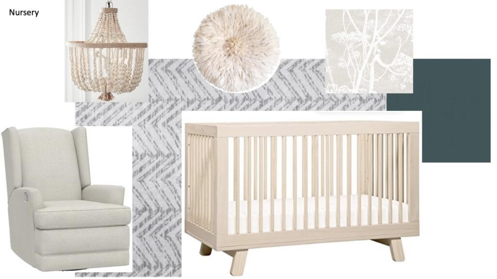
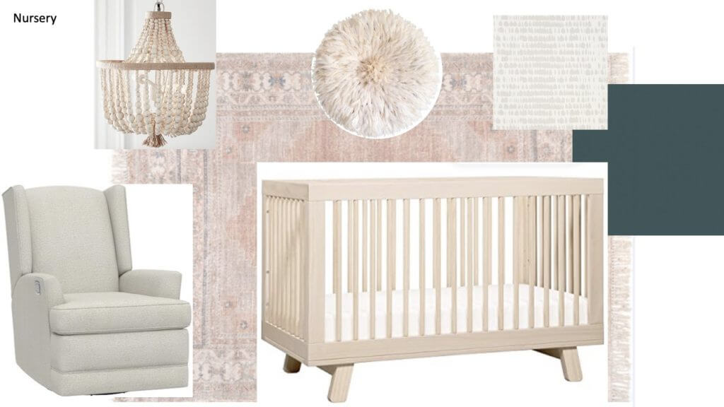
Anyway, I have always envisioned a sophisticated nursery and used quite a few pieces from my original design plan, though I’m glad I swapped in green for gray. I’m over gray and it’s so predictable. Plus I knew that I could use the green to work with either blush or blue tones, depending on if the baby was a boy or a girl! The room looks more like my revised design plan – sans wallpaper – but with a white rug and some wall shelving to bring in color and texture.
See my various design boards below along with our actual nursery to see how the space evolved. I am in love with how the room turned out and wouldn’t change a thing!
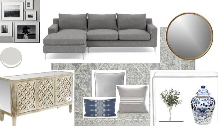
Original Design Plan
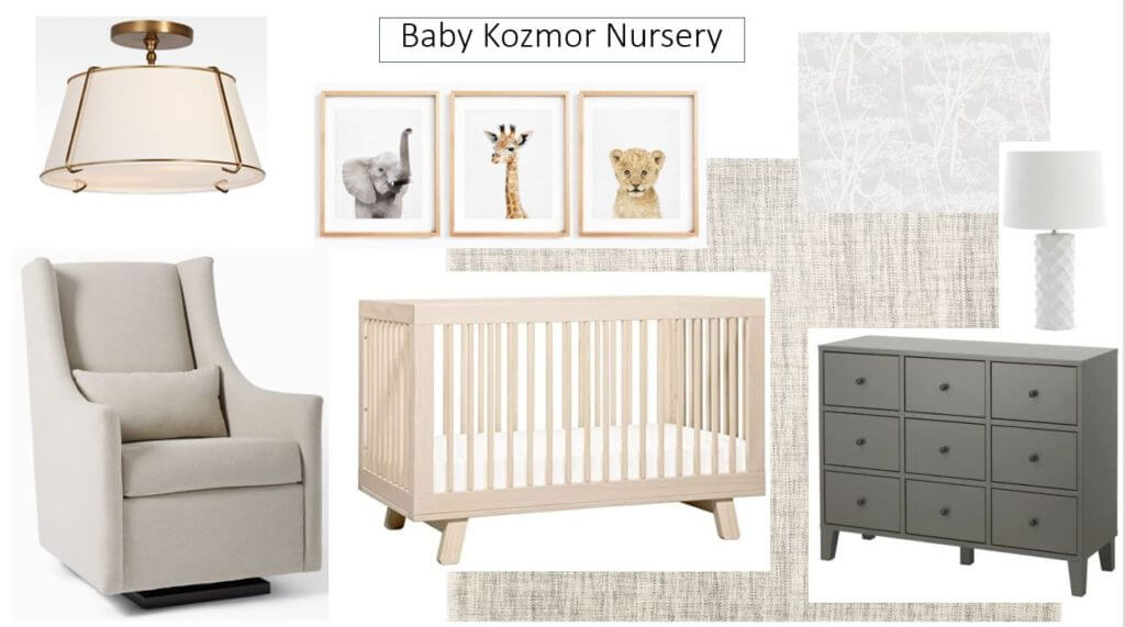
Revised Design Plans 1 & 2
Final Nursery Design:
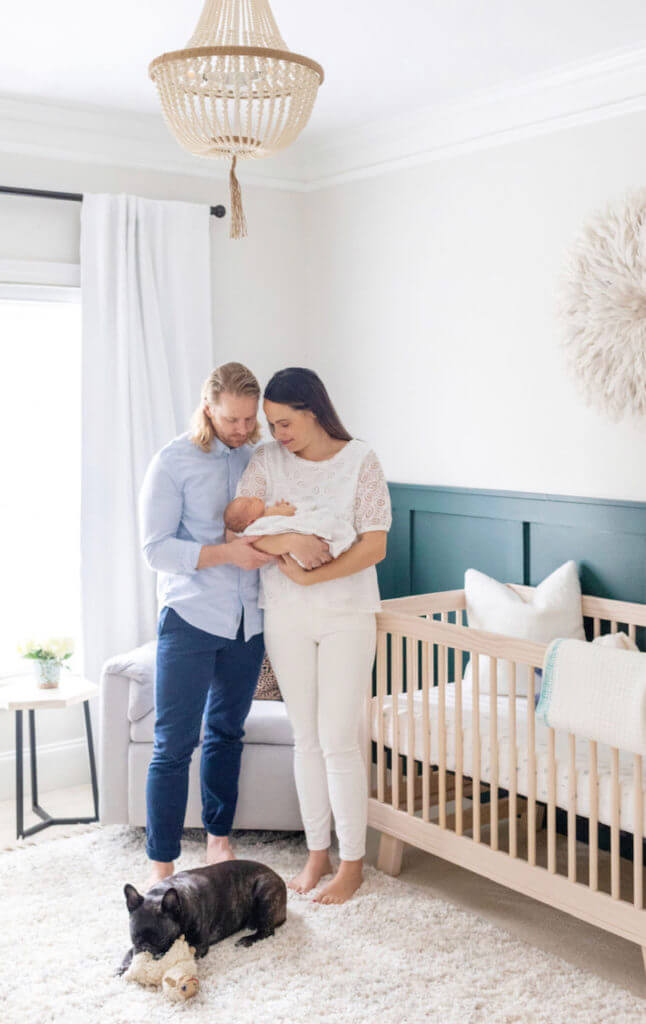
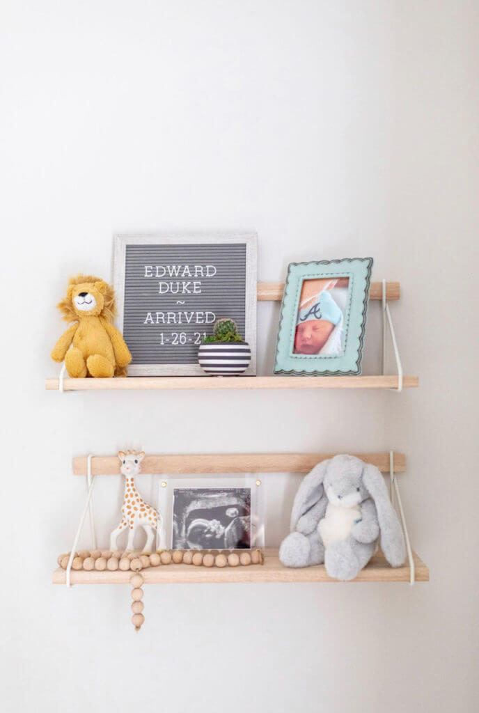
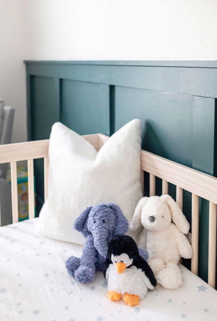

Photos via Silly Goose Photography
[…] Duke’s Nursery Reveal […]